Post-processing and visualising results of KMC simulations can be tedious, time-consuming or prone to errors if done without a dedicated and validated software application. Zacros-post is a graphical user interface that allows you to post-process and visualise the main output files generated by Zacros. This tutorial explains how to install Zacros-post and provides a description of its main features.
If you were on a quest for an intuitive and user friendly app to post-process and visualise the results of Zacros simulations, Zacros-post is the answer! This app is developed in Python and compiled with Nuitka as a standalone executable for convenience. Instructions on how to obtain this app can be found under the Software > Obtain Zacros menu item. This tutorial covers the installation and the features of the app, and assumes that you are already familiar with setting up and running Zacros KMC simulations. If you have already downloaded the .zip or .tar.gz files of Zacros-post (for Windows or Linux respectively) you can follow the steps and learn how to use the app. The snapshots of this tutorial were created on a Windows system, but the procedures are the same for Linux.
If you have not obtained Zacros-post yet, you are more than welcome to read through the tutorial, learn about the app's capabilities and decide whether it suits your purposes. Note that the Python classes of Zacros-post can also be used in Python scripts by importing the files in the py_modules directory. This feature is more advanced and will be covered in a future tutorial. So, let's get started!
Part 1: Installation
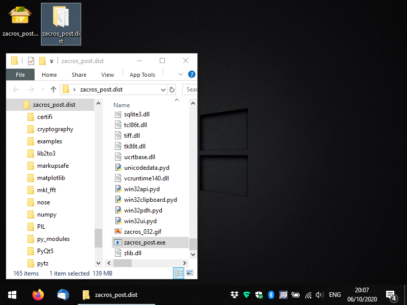
Zacros-post comes in the form of executable files in a compressed folder (.zip for Windows and .tar.gz for Linux). The executables for the GUI-based app are (as much as possible) standalone, though in Windows, you may have to download and install the C++ redistributable libraries (you should do so, only if you get an error message; it should be straightforward but if you have any issues you can contact us). You should uncompress the file you obtained from XIP in a directory of your choice and you should see something like the following:
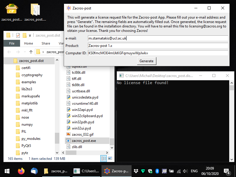
Within the newly-created directory, locate the file zacros_post.exe for Windows, or just zacros_post for Linux and run it (this is the executable for the main app). You should see a console window appearing and a message-box informing you that no license has been found. Click OK and you should see a form appearing, which allows you to generate a license request file, as shown below. You only need to fill out the first field: your email (preferably the institutional email that you used when you placed your order in XIP).
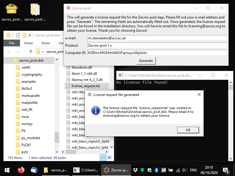
Next, you can press the button "Generate" and you should get a message saying that the license_request.txt file was created in the same folder as the executable. Below, you can see what this message looks like and you can also see the file highlighted in the Windows Explorer. At this point, you can close the app and you will need to e-mail the license request file to the address mentioned in the message (licensing [at] zacros...), so that you obtain your actual license. Note that you should not make any changes to the contents of the license request file; this will lead to data-corruption and you will almost surely end up with an unusable license.
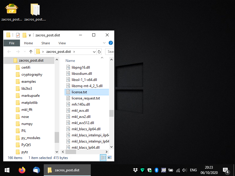
After obtaining your license file (license.txt) you should place it in the same directory as the zacros_post executable, as shown below. Next time you start the app, it should start as normal. In the next section we will discuss the next steps: post-processing and visualising Zacros output data.
Part 2: Visualising the lattice structure
After completing the previously described steps, you should have a working installation of Zacros-post! Once you run the program again, you will see something like the snaphost below. At this point, you can click on "Browse" and navigate to the directory that contains the Zacros output that you want to post-process and visualise. Equivalently, you can just use the menu command: File > Open directory. Note that (at least in Windows) the browsing-window does not list any files, only directories (folders). Zacros-post comes with two Zacros output samples, which you can find in the directory "examples", as shown below: subdirectories 101 and 102 (these are the same as in the Zacros distribution, but in Zacros-post they also contain a post-processing subdirectory each).
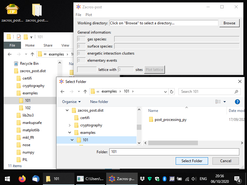
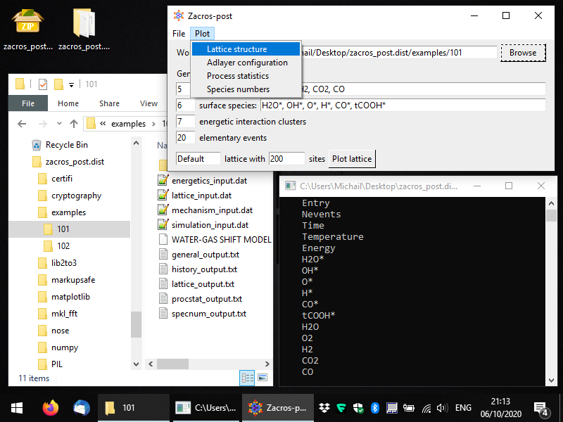
Here, we will work with example 101. Once you select the folder you want to process, you should see some key general information coming up in the Zacros-post interface. This is just intended as a reminder of what the simulation was about... Next, you can click on the "Plot lattice" button, or equivalently from the menu you can select: Plot > Lattice structure, as shown below.
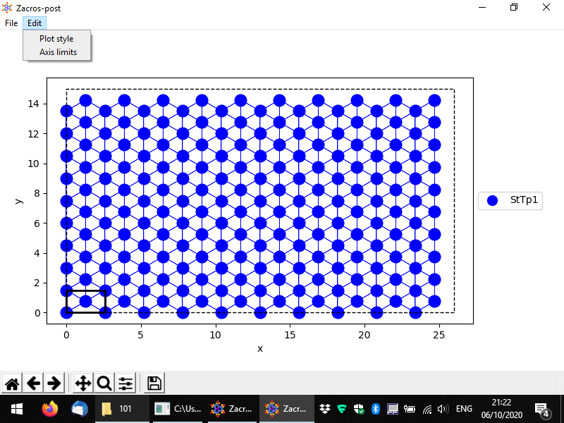
This will start the lattice structure plotting app, which is shown below in full screen. The lattice sites and their connectivity are displayed by default, and the unit cell is highlighted. Sites of different types are shown in different colours and markers, though, in this example, there is only one site type, so all sites are displayed as blue filled circles.
The menu provides options for saving the plot in pdf and png formats and also for customising the style of the plot and the axes limits (as shown). In the bottom, the standard controls of Matplotlib are provided so that you can for instance pan and zoom into the plot, set the white margins and save the plot in many different formats.
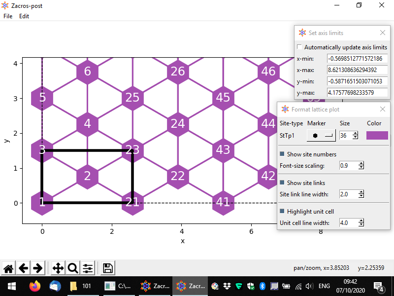
There are quite a few options for changing the style of the plot. In the following we demonstrate an example of a customised lattice. The styling options and the controls are quite intuitive: there is a dropdown menu providing different options for the markers of each site type (here only one type, "StTp1"), and spinboxes for the sizes of graphical elements in the plot. Also, by clicking on the coloured rectangle, you can select a colour for the sites. The colours of the links are automatically determined (by averaging out the colours of the two connected sites). Finally, you can change the limits of each axis, or if you'd like to go back to the original axes limits, you can check the box "Automatically update axis limits".
Once you are done you can close the lattice post-processing app from the menu (File > Close) or simply by closing the lattice window. You may notice the following message on the terminal: "Saved settings of lattice structure plotting app to postprocessing.xml". Indeed, Zacros-post saves all the settings you have customised to that file so that, when you open the same directory again, you won't have to re-apply all the customisations you made. Thus, next time you open directory "examples\101" and try to plot the lattice, you should see exactly what you saw just before closing the lattice post-processing view last time.
Next we will look into the postprocessing of the history output file, and the visualisation of adsorbate layer (adlayer) configurations.
Part 3: Visualising and extracting adlayer configurations
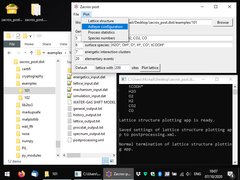
During the course of the KMC simulation, Zacros outputs the occupancy of each site of the lattice in the history_output.dat file. Zacros-post can extract and visualise configurations from this file, and it can also save them in a format that Zacros can use to start a new simulation from (state_input.dat file). To start the post-procssing of adlayer configurations, you can select Plot > Adlayer configuration from the main window of Zacros-post as shown below (in this snapshot, notice also the postprocessing.xml file in Windows Explorer).
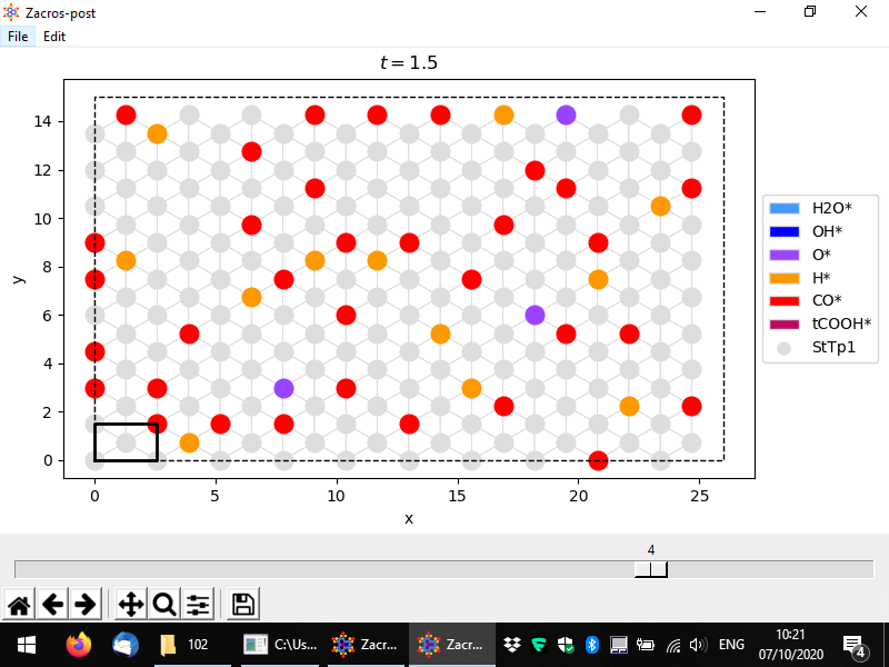
Once you've selected this menu option, you should see a window coming up, as shown in full screen in the following snapshot. In this simulation, we have saved 5 lattice configurations, and the slider in the bottom allows us to select any of them. By default, the last one is plotted; here we have changed this, to plot the 4th configuration, which corresponds to time 1.5, as shown in the title of the plot. Vacant sites are displayed with grey colors using different markers for each site type. Their connectivity is also plotted, and the unit cell is highlighted by default. Sites occupied by adsorbate species are coloured depending on the species. The legend on the right of the plot, shows the colors and markers corresponding to species and site types, respectively. Here we have 6 different species and 1 site type (the latter denoted by circles, as is the default option).
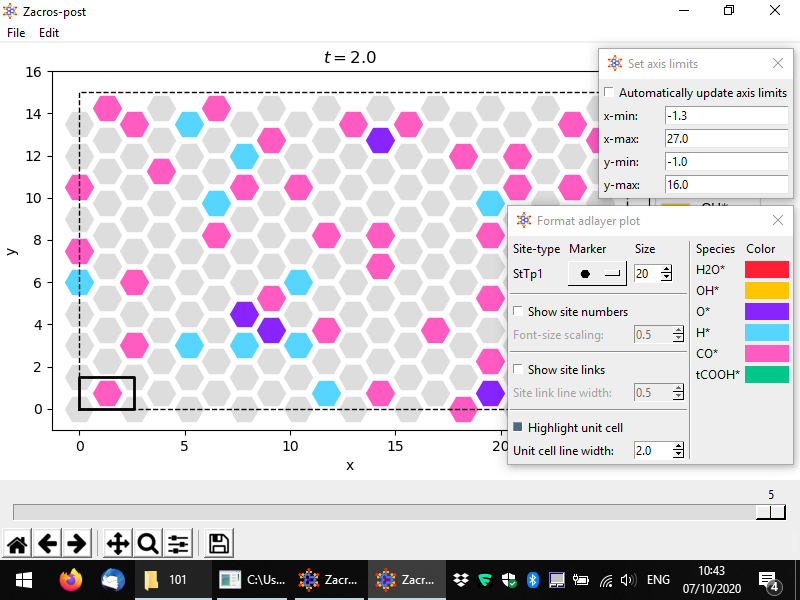
The usual options for panning, zooming, adjusting the white margins or saving the plot can be found in the bottom toolbar. Additionally, the options of saving the plot into png or pdf formats can be found in the File menu option, in addition to the "Save state input" option. The latter can be used to extract the current configuration into a file named "state_input_ExtrConf#.dat", where # is the number of the configuration processed. This file has to be renamed to state_input.dat, if it is to be used as input to a new Zacros simulation. The visual appearance and the axes limits of the plot can be adjusted using the options under Edit. The pertinent controls are shown below.
When you are finished you can close the adlayer configuration post-processing app from the menu (File > Close) or by closing the lattice window, as with the lattice processing app. As with all the post-processing and plotting apps, the customisations you applied to the adlayer configuration will be saved into postprocessing.xml.
In the next part we will showcase and discuss the postprocessing of the event statistics.
Part 3: Post-processing and visualising event statistics
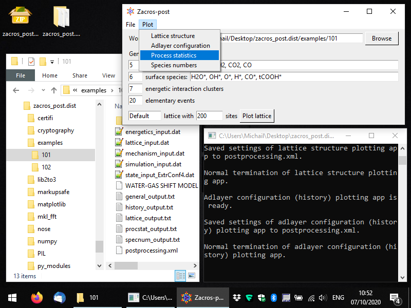
During the course of the KMC simulation, Zacros aggregates the statistics of the occurrence of elementary events (adsorption/desorption, diffusion, different types of reactions) into procstat_output.txt. Post-processing and visualisation of this file can be done with Zacros-post, by selecting the appropriate option from the main window's menu, as shown below (notice also in the Windows Explorer the extracted adlayer configuration file state_input_ExtrConf4.dat which we generated in the previous part of this Tutorial).
After selecting this menu option, you should see a window like the one in the following snapshot. By default, all events in the KMC simulation are listed, even ones that were defined in the mechanism_input.dat file, but did not occur (i.e. were not sampled by the KMC algorithm during this simulation). Zacros-post groups the forward and reverse steps of reversible events, and for each of these events it calculates the occurrence frequency of the forward and the reverse step (i.e. the number of events occurred divided by the duration of the simulation). These are plotted as the bars labelled "fwd" and "rev", respectively, in a bar graph like the one below. In addition, Zacros-post calculates and plots the net rates of the reversible events, as the forward rate minus the reverse rate. If the net rate is positive, a "net-fwd" bar is plotted, otherwise a "net-rev" bar is plotted. Thus, while for a reversible event you may see both "fwd"- and "rev"-labelled bars, you will always see only one of the "net-fwd" and "net-rev" bars.
Moreover, notice the dashed vertical line around the occurrence frequency of 0.5: this line corresponds to the occurrence of a single event in the entire duration of the simulation. If you open general_output.txt and scroll down to the bottom (after the "Simulation stopped" message in that file), you will see that the simulation covered approximately 2 KMC time units; thus, the frequency of 1 event would be about 1/2 = 0.5. This frequency, with the corresponding dashed vertical line in the bar graph, provides important information about the "threshold of accuracy" of your simulation: clearly you should never see a bar below that line, since you cannot have "a fraction" of 1 event happening during your KMC simulation. Moreover, bars close to this threshold correspond to frequencies of events that were estimated with only a few event occurrences, so they are expected to be subject to relatively large errors. For instance, if, for one of the events in our simulation, Zacros had only sampled two events, we would have seen a bar at occurrence frequency of around 1, and this would be quite an inaccurate estimate: what if in a different realisation of the KMC simulation we had 3 events, or just 1 event? The relative error of this frequency of 2±1 events would be quite large indeed.
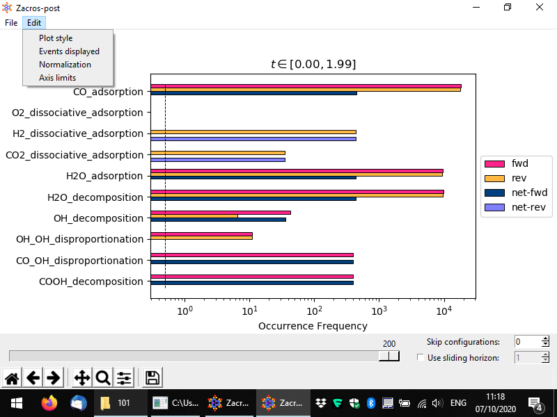
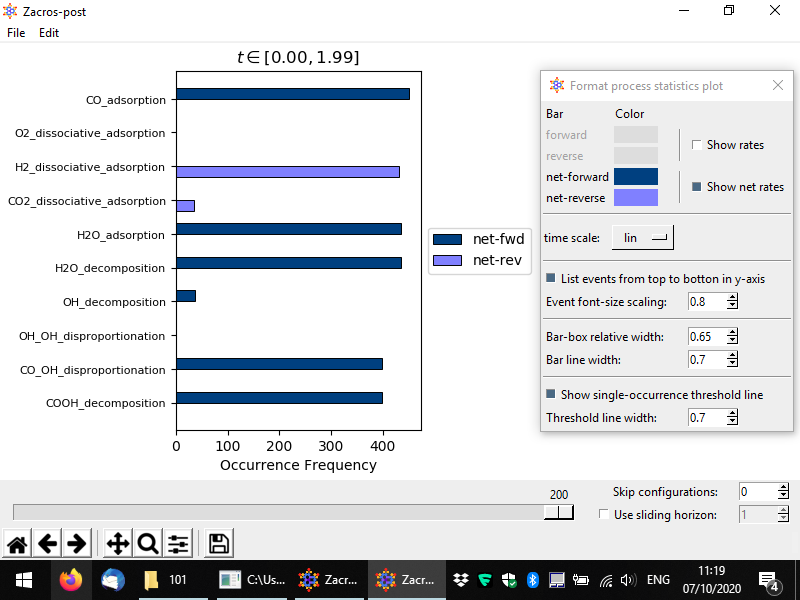
Certain post-processing and styling options can be set using the Edit menu, which is shown above. Thus, custom axes limits can be set from Edit > Axis limits; this works in a similar way as we have discussed for the lattice structure plot, so we won't present is again here. Moreover, the style of the plot can be customised from the Edit > Plot style option as shown above. The controls of the pertinent popup window are quite intuitive, and below you can see a customised plot in which we are plotting only the net rates, we have set the x-axis to display things in linear scale, and we have decreased the font size of the event name labels. We have also added some white margin on the right of the plot, using the second to last button of the Matplotlib toolbar at the bottom of the window (whose icon looks like three sliders).
Plotting the frequencies in linear scale can be useful when trying to draw conclusions about the active pathways and check whether the simulation has reached stationarity (roughly speaking, the equivalent of steady-state behaviour for stochastic systems). For instance, below, we see that the forward rates of CO adsorption, H2O adsorption and H2O decomposition, are almost equal to each other, and also equal to the reverse rate of H2 adsorption (thus, the forward rate of H2 desorption). This is good news, as it is in line with the stoichiometry of the water-gas shift reaction (CO + H2O → CO2 + H2). What about the rate of CO2 production? Note that the overal rate at which CO2 is elicited from the surface is the sum of the rates of CO oxidation (CO* + O* → CO2) and CO-OH disproportionation (CO* + OH* → CO2 + H*). In this simulation, the former event is represented as the reverse of the CO2 dissociative adsorption event. Indeed, you can easily see that the length of e.g. the H2 dissociative adsorption bar, is approximately equal to the sum of the lengths of the following two bars: the light purple bar for CO2 dissociative adsorption plus the length of the bar for the CO-OH disproportionation reaction.
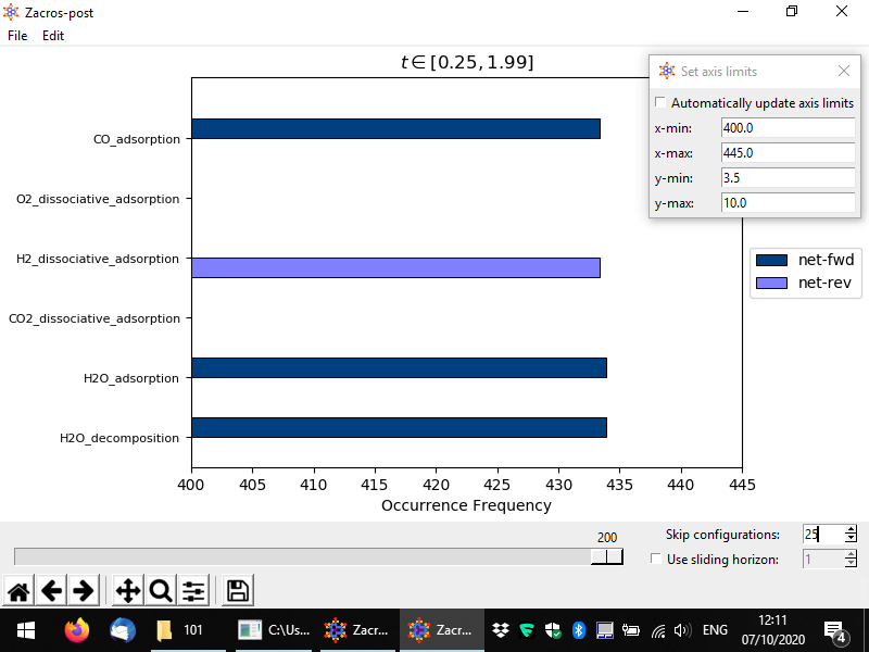
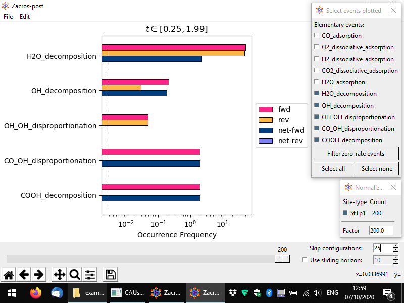
In the preceding discussion, you may have noticed that the CO adsorption rate seems actually slightly larger than e.g. the H2 dissociateive adsorption event. This is because in our sampling we are including initial configurations for which the system has not yet reached stationarity. This can be easily remedied in Zacros-post: notice the tollbar with the slider and the two input boxes labelled "Skip configurations" and "Use sliding horizon" (the latter is actually a check-box, which enables the correspnoding option). By changing the number of skipped configurations to say 25, and zooming into the plot (see below) we see that the frequency of occurrence of CO adsorption is equal to those of the other events (of course, there is always some randomness in the KMC simulation which results to deviations from "perfect equality"). Note also, in the plot below, that the time interval in the title of the plot has been updated, with the low bound being now 0.25.
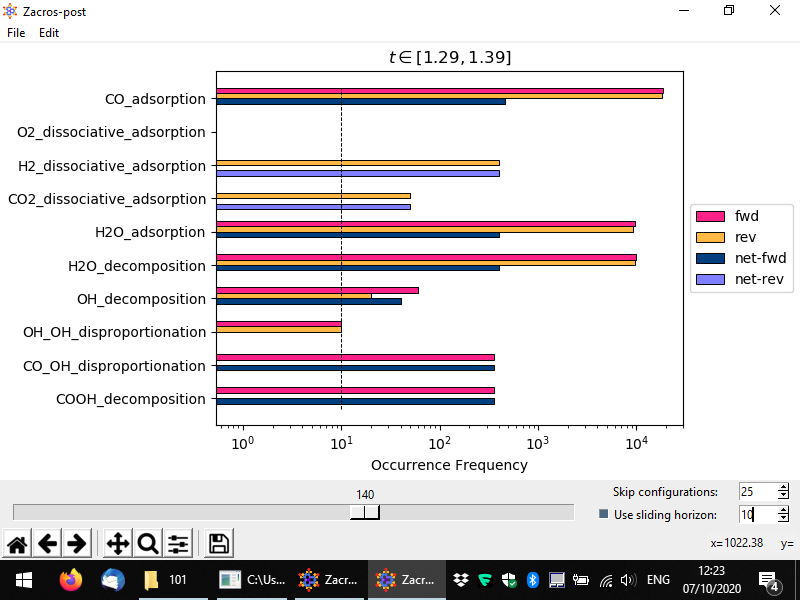
In a similar way, one can use the "sliding horizon" option to restrict the processing of the event statistics to a "moving window" of ΔN configurations (entries in the procstat_output.txt file). Below you can see an example in which we process configurations N1 = 130 to N2 = N1 + ΔN = 140, the latter being the one noted by the slider (we also skip the first 25 configurations, this does not affect the numbering). For this example simulation the sampling of the event statistics is done at regular time intervals of Δt = 0.01 units of time (see simulation_input.dat), and therefore these configurations correspond to time points (N1 − 1)*Δt = 1.29 and (N2 − 1)*Δt = 1.39, as noted in the title of the plot. Compare this plot with the corresponding one we showed first in this section; you will notice that the plots look quite similar (taking into account the stochasticity of the KMC simulation), which is positive news, as it means we are sampling the system in the stationary regime. However, there is a key difference between these two plots: in the one below, the dashed horizontal line denoting the frequency of the "single event" (also, the threshold of accuracy of our simulation), has now moved to higher values. This is expected: previously we were considering the aggregate statistics over an interval of about 2 KMC time units. Now, we are considering a much smaller interval, or merely 0.1 time units. Thus, the threshold of accuracy now is much higher: we cannot "measure" frequencies lower than 1 event per unit time.
There are two more features that we will discuss before closing this section. From the menu, by choosing Edit > Events displayed, you can easily switch on or off any of the events displayed in the bar graph, e.g. you may choose to only plot reaction events (no adsorption/desorption events), as shown below. In addition, by choosing Edit > Normalization, you can normalise the event rates with respect to the number of sites. You can choose one or more site types (if applicable); in the latter case, the sum of the number of sites for the chosen types will be used, and the occurrence frequencies displayed in the bar graph, will be calculated as: number of events occurred divided by the time interval, divided by the number of sites specified.
Once you are done with the events statistics' post-processing you can close the window and your custom settings will be saved into postprocessing.xml, as discussed for the the other apps.
In the next and final section of this tutorial, we will look into the postprocessing of the species numbers and associated information written in the specnum_output.txt file.
Part 4: Post-processing and visualising species numbers and associated information
This final section of Zacros-post is dedicated to the post-processing and visualisation of specnum_output.txt. This is probably the "easiest" file in terms of structure: its first line contains headers explaining what the data that follows is. The data is provided in tabular format; each line lists things like the number of total events occurred, the energy of the adlayer, and the numbers of adsorbed molecules, as well as the numbers of gas-phase molecules produced or consumed up to that point in the KMC simulation. The file can be imported as a delimited text file and plotted in Excel, Matlab or Python. However, Zacros-post, conveniently provides the option of normalising these numbers with respect to the desired site type(s) to produce coverage plots, which can also account for multidentate species.
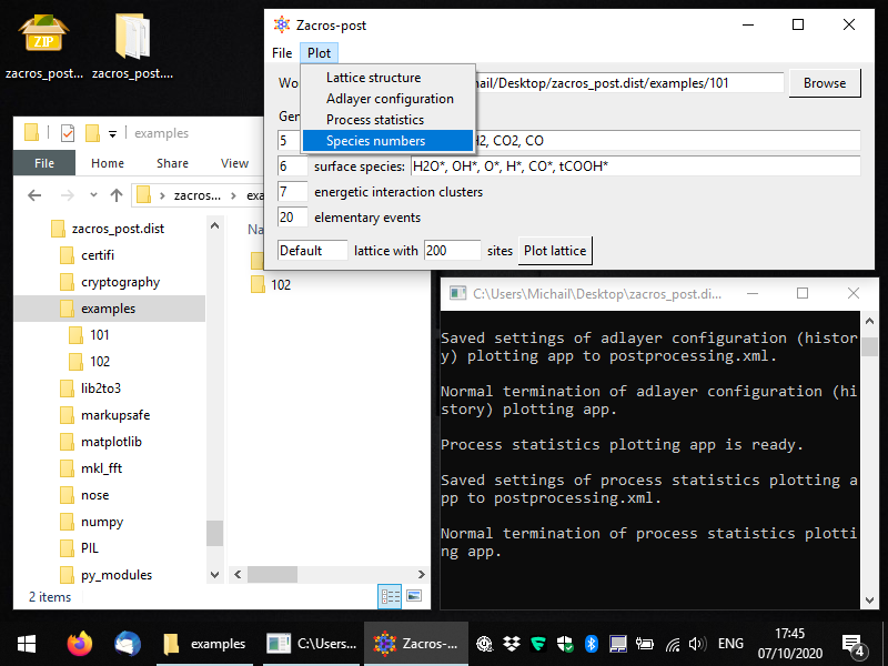
To start the pertinent app, you can select Plot > Species numbers, as shown below.
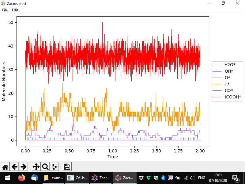
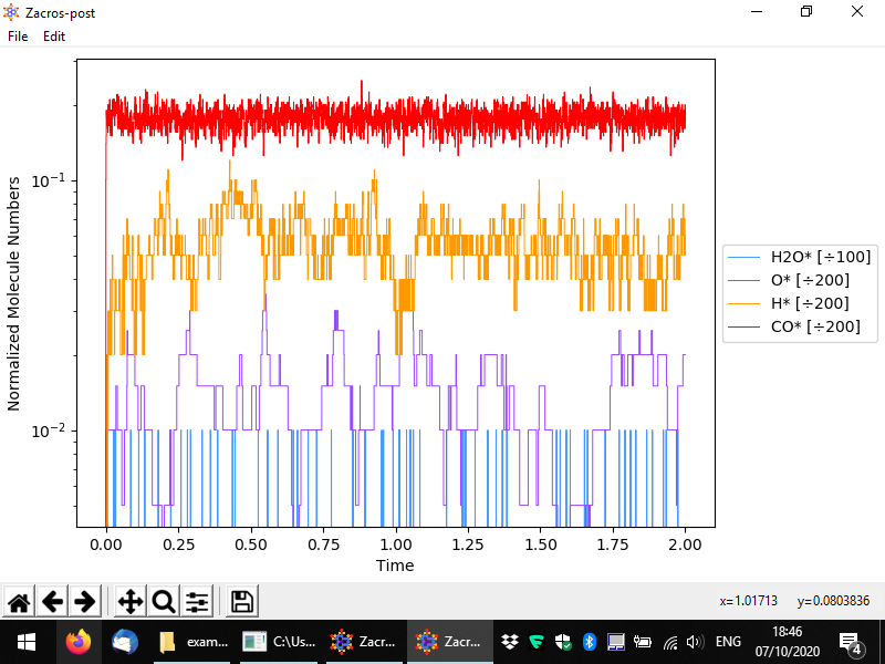
You should then see something like to the following. By default the numbers of surface (bound) species are visualised with respect to time, in a pretty intuitive way. Here we have a lattice with a total of 200 sites mostly covered by CO*, and to a secondary degree by H* and O*. Water (H2O*) is a low coverage species, whose population on the surface fluctuates between 0 and 1.
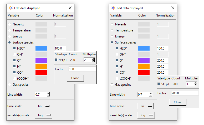
From the menu, you can customise the data plotted, the visual appearance of the plot (styles), and apply normalisation constants in order to calculate e.g. coverages. To access these options, go to Edit > Plot style and data. The relevant popup is demonstrated below. Options are given to visualise the number of events, the temperature, the energy and the numbers of surface molecules (default, shown below) or gas molecules. By unchecking the sqaure on the left of a species, you can make the corresponding line disappear, and by clicking on the colored rectangle, you can change the color of the line. Moreover, by clicking on the "Normalization" rectangles (currently populated by 1), a menu shows up that allows you to define a normalisation constant as shown below; we will discuss this menu shortly. Some other options given pertain to the scale of the axes (linear or logarithmic) and the widths of the lines in the plot.
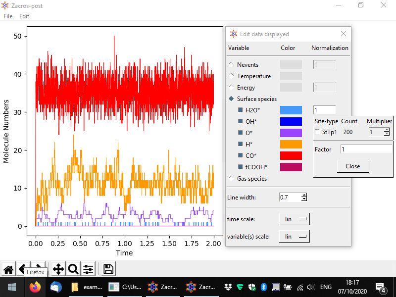
Let us now discuss the normalisation menu in more detail. The latter allows you to easily define the normalisation factor that can be used to plot surface coverages. This factor is calculated as the sum of the numbers of site of the type(s) selected divided by the corresponding multipliers. The multiplier is intended to represent the number of sites covered by one molecule of the species of interest. In this example, we only have monodentate species, but for demonstration's sake, let us say that water was a bidentate molecule. In this case, for each bound molecule we would have two sites covered, and thus whenever we have one molecule on the surface, the coverage would jump from zero to 2/200 = 0.01. Thus, the normalisation factor is 100 since the number of bound molecules is divided by 100 to calculate the coverage. The figure below shows exemplar normalisation menu options for two species, and the following figure shows the corresponding plot.
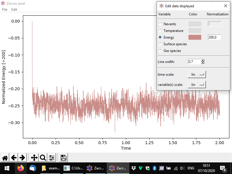
Other variables can be plotted as well, for instance the following figure demonstrates a plot of the energy per site.
Conclusion
Post-processing Zacros output data can be greatly facilitated by a dedicated and robust graphical user interface like Zacros-post, as shown in this tutorial, which covered the main features of this app. We welcome your suggestions about how to make Zacros-post, more user friendly and powerful.


