Part 4: Post-processing and visualising species numbers and associated information
This final section of Zacros-post is dedicated to the post-processing and visualisation of specnum_output.txt. This is probably the "easiest" file in terms of structure: its first line contains headers explaining what the data that follows is. The data is provided in tabular format; each line lists things like the number of total events occurred, the energy of the adlayer, and the numbers of adsorbed molecules, as well as the numbers of gas-phase molecules produced or consumed up to that point in the KMC simulation. The file can be imported as a delimited text file and plotted in Excel, Matlab or Python. However, Zacros-post, conveniently provides the option of normalising these numbers with respect to the desired site type(s) to produce coverage plots, which can also account for multidentate species.
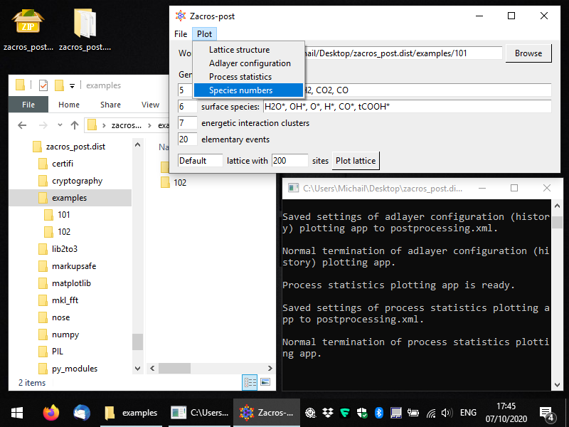
To start the pertinent app, you can select Plot > Species numbers, as shown below.
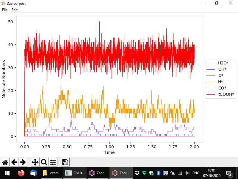
You should then see something like to the following. By default the numbers of surface (bound) species are visualised with respect to time, in a pretty intuitive way. Here we have a lattice with a total of 200 sites mostly covered by CO*, and to a secondary degree by H* and O*. Water (H2O*) is a low coverage species, whose population on the surface fluctuates between 0 and 1.
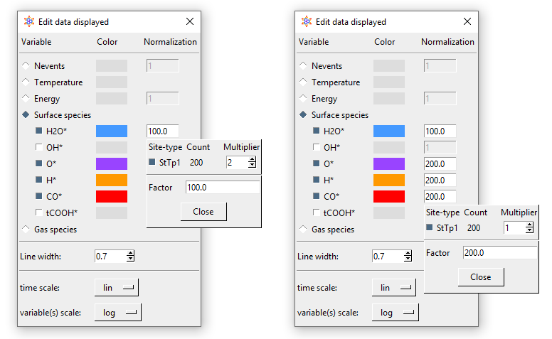
From the menu, you can customise the data plotted, the visual appearance of the plot (styles), and apply normalisation constants in order to calculate e.g. coverages. To access these options, go to Edit > Plot style and data. The relevant popup is demonstrated below. Options are given to visualise the number of events, the temperature, the energy and the numbers of surface molecules (default, shown below) or gas molecules. By unchecking the sqaure on the left of a species, you can make the corresponding line disappear, and by clicking on the colored rectangle, you can change the color of the line. Moreover, by clicking on the "Normalization" rectangles (currently populated by 1), a menu shows up that allows you to define a normalisation constant as shown below; we will discuss this menu shortly. Some other options given pertain to the scale of the axes (linear or logarithmic) and the widths of the lines in the plot.
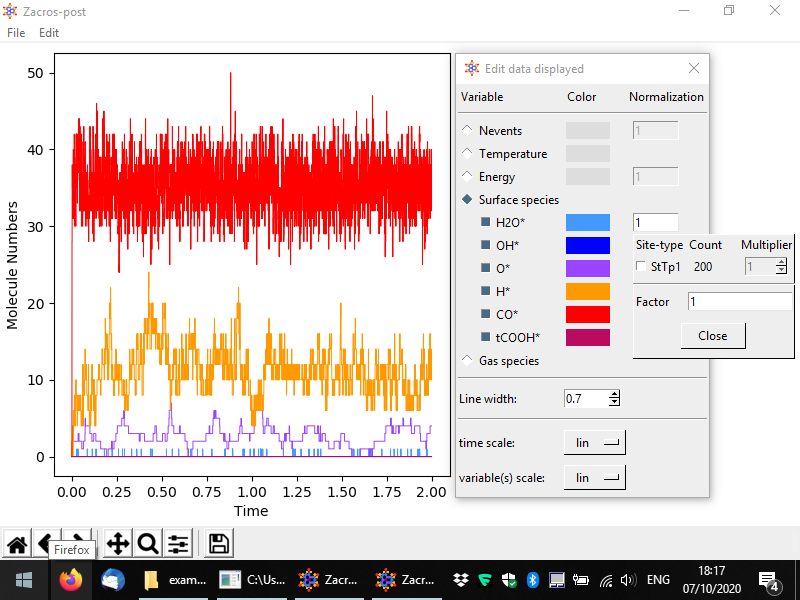
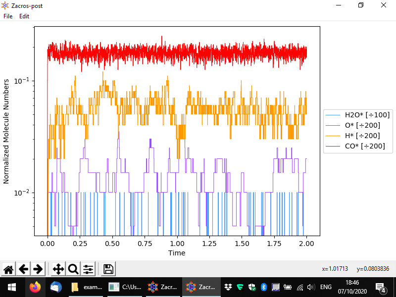
Let us now discuss the normalisation menu in more detail. The latter allows you to easily define the normalisation factor that can be used to plot surface coverages. This factor is calculated as the sum of the numbers of site of the type(s) selected divided by the corresponding multipliers. The multiplier is intended to represent the number of sites covered by one molecule of the species of interest. In this example, we only have monodentate species, but for demonstration's sake, let us say that water was a bidentate molecule. In this case, for each bound molecule we would have two sites covered, and thus whenever we have one molecule on the surface, the coverage would jump from zero to 2/200 = 0.01. Thus, the normalisation factor is 100 since the number of bound molecules is divided by 100 to calculate the coverage. The figure below shows exemplar normalisation menu options for two species, and the following figure shows the corresponding plot.
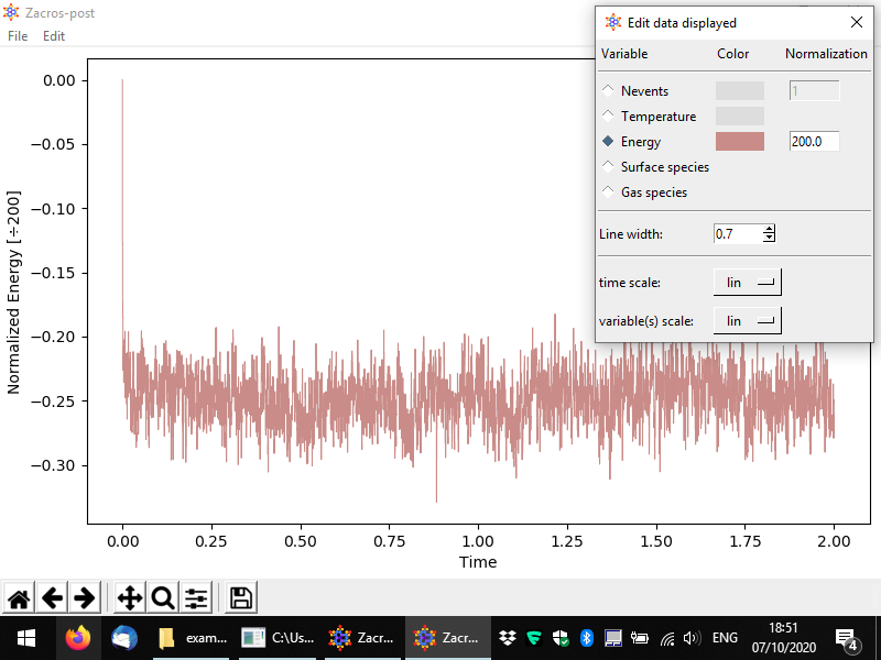
Other variables can be plotted as well, for instance the following figure demonstrates a plot of the energy per site.
